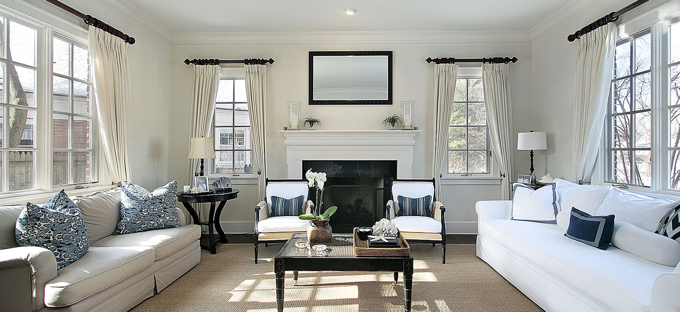
The colour scheme you choose for your home holds more power than you might think, and can make or break the overall atmosphere and feel of each and every room. Choose wrongly, and you could easily make a space that is supposed to feel cosy – like your living room – feel cold or clinical, while the right hues can add warmth and luxury, making it a room you’ll look forward to spending time in.
It’s not just the feel of the room itself that can be impacted, either, and our emotions have been shown to be affected by the things with which we surround ourselves. Colours, in particular, have the power to impact our mood, and can feel depressing or uplifting in equal measure, depending on which way you choose to go.
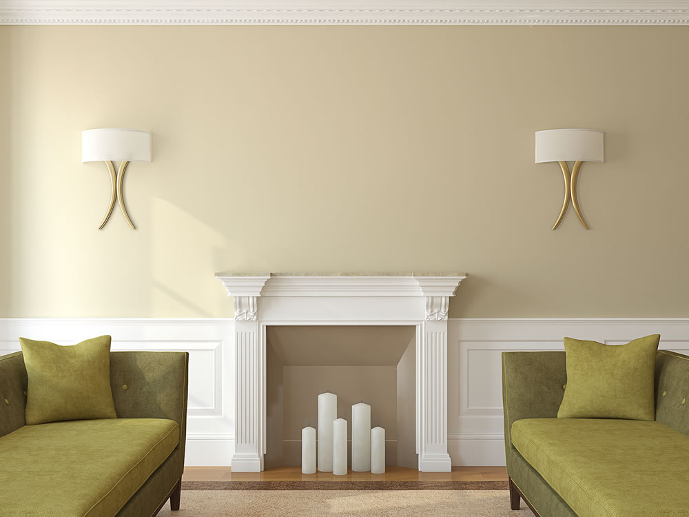
And of course, all feelings aside, another major reason your home colour scheme deserves careful consideration is to ensure that you are aligned with the latest trends. Socialising may be off the agenda for the moment, but over the coming months the world is set to open up – which means luxurious dinner parties and home cocktail nights could soon be back on the agenda – and is all the more reason to ensure that the aesthetics throughout your abode are on point.
So, if you’ve been considering a home makeover, there is no better time to get started – and Michael Payson, paint specialist and owner of Paysons Painting is on hand to share the top luxury paint colour combinations to consider for your living room in 2021.
Calming new neutrals
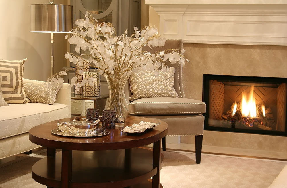
Warmer neutrals, such as milky and almond hues, have seen a resurgence of late, leaving the cooler, grey-toned shades of the past few years behind. This year, we’ll see a move away from the stark yet edgy shades that have previously dominated, with cosy spaces taking centre stage.
The good news is that such tones combine effortlessly with almost all other colours, so if you’re eager to add some interest with accessories or soft furnishings, then you’ll have few clashes when doing so. Painting your walls in simple yet warm-leaning neutrals can make for a surprisingly effective backdrop for just about any interior design style, and will keep you well ahead of the style curve, too.
Serene greens
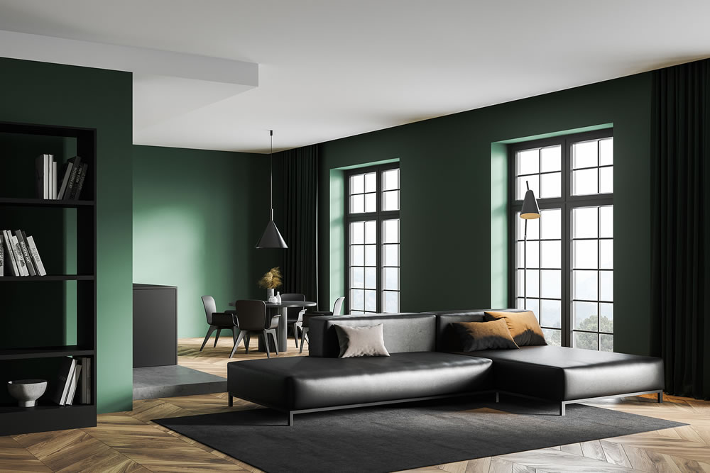
Verdant shades of green are everywhere for spring / summer 2021, bringing an element of nature into our homes and with them, the calming qualities we could no doubt all do with after a tumultuous year. House plants have been a huge trend in recent years, and the move towards green colour schemes and paint colours is a natural progression from that. With multiple studies having shown that spending time in nature boosts our mental health and wellbeing, we’re moving more and more towards bringing the outdoors indoors and from rich, velvety dark tones to their lighter and more uplifting counterparts, greens are officially the new grey that eclipsed all other home paint tones in the last decade.
If you pick only one shade for your walls, make it a sage green. It’s the colour we’ll all be coveting this year.
Mulberry tones
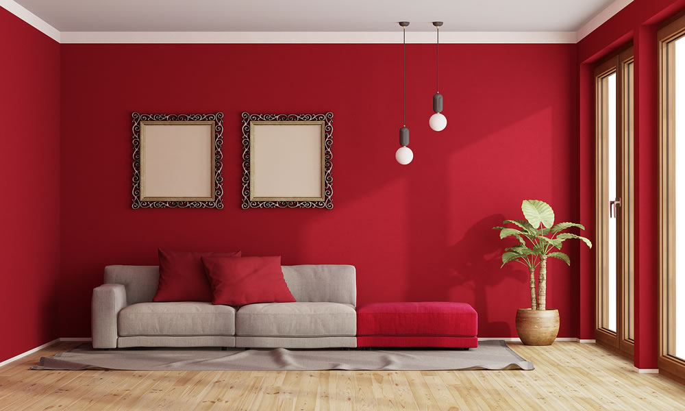
There are few tones that ooze luxury quite like deep reds and mulberries, but beware, because with this colour palette, less is almost always more. Think less boudoir vibes, and more warming and comforting, and some combinations that are a huge departure than those we’ve seen in the past. This year, we can expect to see barely-there pale greens and chocolate browns entering the arena for an edgy and modern look that is welcoming and effortlessly chic, and creates a dramatic and intimate space both you and your guests will love.
Back-to-basics beige
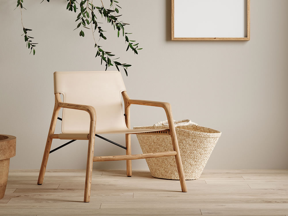
Beige might seem a little retro, and in fairness, it is – but there is a reason it has enjoyed such popularity over the years, and that is its versatility. Easily combined with any colour palette and creating a simple and unassuming backdrop, it’s a simplistic shade that can be translated in a variety of different ways, depending on how it is styled.
While the ‘Natural Hessian’ and ‘Calico’ shades of the 2000s are long gone, we’ll see similar tones make a return in 2021 with new names and warmer undertones.


