Writer and home makeover designer Rachel Hunt shares the story of her home renovation in our three-part special. Follow her journey from attempting to complete a double storey extension before the arrival of her first child to the finishing touches of her now complete home. She offers up expert advice for any type of renovation project as well as tips on decorating and adding that final flair to your home.
Last year my husband and I took on a complete home makeover project. We completed this in two stages – the build and the interior, so to simplify things I have featured these in two parts, with a third part on my top tips for updating your home with the all important finishing touches.
Once the build was complete it was time to tackle the interior. For me, as I couldn’t nest during that all-important part of the third trimester in my pregnancy due to the house build, I wanted to start with the nursery first, especially with Leo’s arrival, however more practical jobs had to be completed first. But before we could start on any of the rooms the flooring had to go down.
Carpet and underlay
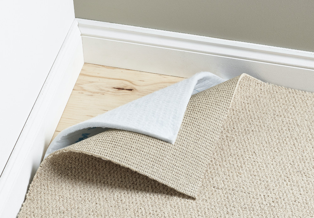
This time we went eco friendly! Our underlay is by SpringBond – made from recycled PET plastic bottles and other single use plastics. It contains no harmful VOCs and results in better air quality throughout the home.
It’s inherently flame-resistant, requiring no FR treatment. As well as being green, clean and durable, with a depth of 11mm it offers superb under-foot comfort. This was finished by a neutral hardwearing carpet, which came from Beccles Carpet Centre.
Wooden flooring
With a new baby and three animals, we opted for a wooden floor solution downstairs. Our wooden floor came from Rigeons and was laid by our carpenter. We then used rugs by Harveys and The Rug Seller to warm up areas of the house. Once all the flooring was down it was time to start decorating room by room.
The bathroom
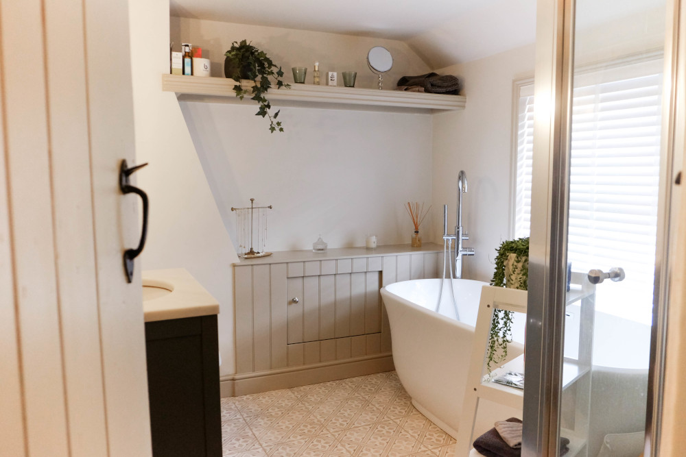
When we started our extension, due to knocking down the old ground floor bathroom, we knew the bathroom would be one of the first renovations we got our teeth stuck into. This was the first room we started and the last room we completed!
Due to the room being our old second bedroom, it was not very spacious so needed careful planning, especially when I wanted to include a large freestanding bathtub.
In order to lay our floor tiles, we had to enlist the help of a professional tiler. It took 10 bags of leveler to level our floor, but the end result was great, we could never have done this bit ourselves.
Our sink and vanity unit came from Laura Ashley, whilst toilet and bath came from Soak. My husband Sam built in storage and shelving and agreed to bath for a while before coming up with a shower solution.
A year later, with thanks to Mira Showers, we were able to find a small compact shower – perfect for a snug cottage bathroom. The bi-fold shower was 700 x 1000 and just fitted into our bathroom. They have great space saving solutions such as this as well as much larger fittings.
The finishing touches were the light fittings from Suffolk Company Jim Lawrence. Sat either side of our mirror they give the perfect light for hair and make-up.
Stockists
Paint: Little Greene – walls: Rolling Fog Pale, woodwork: Rolling Fog Mid
Furniture, sink and taps: Laura Ashley Bathroom
Bath: and toilet : Soak.com
Towel Rail: Wickes
Shower and Cubical: Mira Showers
Lights: Jim Lawrence
Floor tiles: Laura Ashley
Accessories : Mirror – John Lewis, shelf stand – Amazon, plant – Urban Jungle, bathmat – Dunelm
The nursery
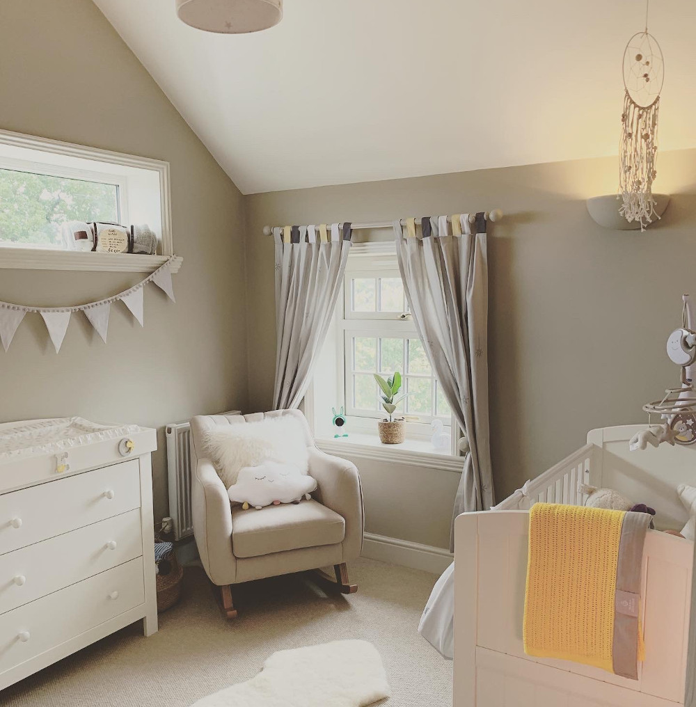
Creating the nursery you’ve always dreamed of for your baby is an exciting experience, and although mine came after the birth of my son – at least I had lots of time to think about the theme. Here are a few of my top tips for putting together a peaceful nursery.
Theme
The best thing to do is choose some neutral tones for the wall and accessorise with a form of shiny metal such as gold. This is one of the most effective ways of making your house look more expensive and stylish.
Choosing a paint brand wasn’t difficult for me at all, as a massive Farrow and Ball fan and with a new baby on the way, their eco friendly paint formulas are cruelty free and made by using recyclable materials. Also great for families as with F&B you don’t get a nasty odour afterwards.
Bedroom furniture
We got all of our furniture as a matching set from Mamas and Papas.
The cot
The cot should be your investment piece in the room. Firstly your baby may sleep in it for three years or so and secondly if you plan on having more children it can last through to the next one.
The changing table
With babies come dirty nappies! And, really, the only way to make this experience as pleasant as possible is to be sure you have all the essentials close at hand, which is where your changing table comes in handy.
The nursing chair
This may well be the most important purchase in your nursery, a comfortable place to sit. You’ll sit here to rock your baby to sleep, feed him, read to him, laugh with him, cuddle with him, so choose your rocking chair wisely.
Décor
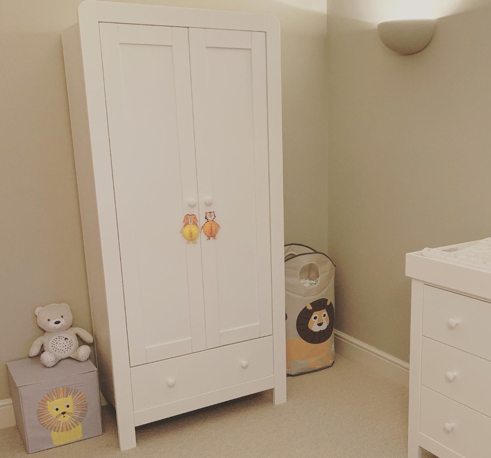
Now that you have most of the functional pieces of your nursery, you can get to work really decorating the space. The rug is a great place to start. It can add a lot of personality to the space – I loved this sheepskin rug (it is also lovely for photos).
I also went with the ‘lion’ theme due to Leos name and star sign; the yellows went well with the Sudbury yellow we chose as our accent colour. I also added some natural elements such as the dream catcher and bunting to soften the look.
Storage
For such a tiny person comes a lot of stuff! Toys, clothes, muslins, blankets… it all needs to go somewhere. We chose storage that would fit our needs for today and tomorrow. Be sure that basket you buy for blankets can hold something else when you’re done with the baby phase.
The Powell storage boxes were a great way to carry on our room theme, the yellow and grey scheme went perfectly with this design for our ‘little lion’. After much research, a lick of paint and some finishing touches, Leo’s lair was complete.
Stockists
Paint: Farrow and Ball – walls – Drop Cloth, woodwork – School House White, ceiling – Wimborne White
Furniture: Cot, wardrobe, nursing chair and nappy station from Mamas & Papas
Storage boxes: Powells
Laundry basket: 1twokinds
Leo name sign: Fred and Robbin (Not on the high street)
Accessories: Pendant light, curtains, cushions and nappy storage from Mamas & Papas, bunting and floating shelves from Snuz, sheepskin rug from The Little Green Sheep, dream catcher from Not on the high street, yellow blanket from Mama Designs, candle from Illumines, LEO letters from Jo Jo Maman Bebe, planter from Sass & Belle, cot mobile from Chicco
The master bedroom
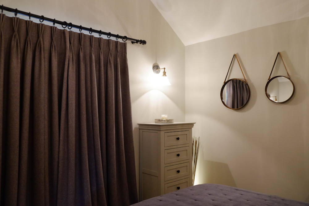
The master bedroom is often one of the most overlooked rooms in the house, after all, it’s not a spot most guests visit! With its vaulted ceilings, our master bedroom could look quite cold so to warm it up I added a lot of luxurious touches, most notably in the bedding.
By using a bedspread such as this one from Wallace Cotton not only does it look sumptuous it also doesn’t matter if you iron the bed sheets underneath (I learnt that from good ol’ Mrs Hinch)!
Continuing with textures, the curtains by Stitched.com are one of my favourite additions to the space. They were made from hemp and the colour lead works well with the Farrow and Ball tones in the room. They are probably the nicest curtains I’ve ever owned, and truly make this space feel like home.
The jewel in the crown of this room has to be the lighting; it really does feel like a hotel room. The pendants we sourced were from Industville, They give the room a really soft light at night-time – the glass panels create beautiful shapes that appear on the walls and ceiling, which can be controlled by a dimmer switch.
We kept furniture light and finished off with some beautiful hanging mirrors from Harveys, they just finish off the room and once again add another texture with the leather fabric. This room is almost too posh now to sleep in!
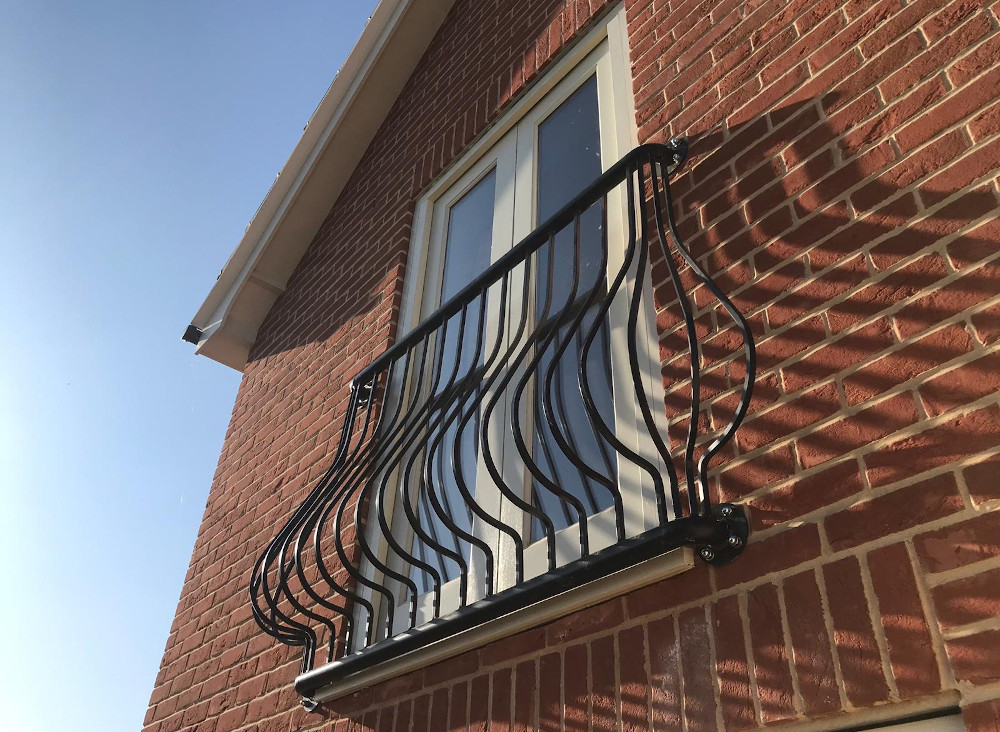
No master bedroom is complete without a balcony! So a Juliet balcony also overlooks our garden at the back of the house.
Stockists
Paint: Farrow and Ball – walls: Hardwick White, woodwork: Shadow White, ceiling: Wimborne White
Furniture: TV stand, bedside table and drawer from Oak Furnitureland
Curtains and blind: Stitched.com
Towel rail: Wickes
Bedspread: Wallace Cotton
Mattress, Alpaca duvet and pillows: Milam
Bed: Bensons
Headboard: Laura Ashley
Lights: Industville (2 wall lights, 1 pendant light, 2 bedside lights)
Accessories : Mirrors – Harveys, candle tray – Tesco, twig light – NEXT
The guest room
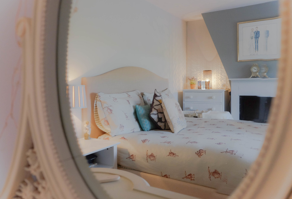
Our guest bedroom was our old bedroom, and was decorated just after we moved in to the house. There wasn’t much that need to be done to this room at all – as it was in the existing part of the house.
However, I felt it needed a refresh of paint (same colours but it’s always nice to freshen up the walls again and to get rid of scuffs and marks), I then added some new bedding, extra cushions and a new lampshade. Just so this room does not feel left out.
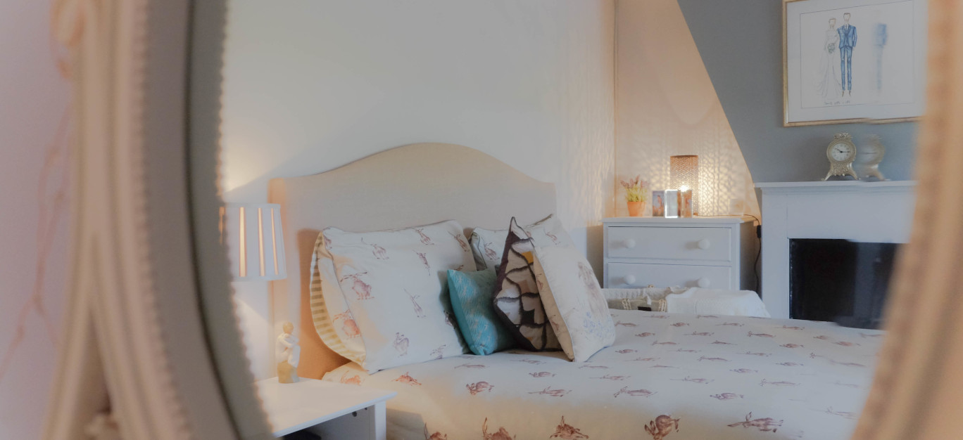
I also swapped some furniture and got rid of items that were not white and added some new bedding. I love the Leaping Hare from Wrendale but I also have the new Laurence Llewelyn-Bowen set as a change over.
Never underestimate the power of a comfortable space for your guests. Guest bedrooms should be three things: inviting, functional, and comfortable. You should make your own extra space a place just as cosy as your master.
Stockists
Paint: Farrow and Ball – walls: Dimpse, Blackened, feature wall: Manor House Grey, woodwork: Dimpse, ceiling: Wimborne White
Furniture: TV stand – Noa and Nani, bedside table – NEXT, wardrobes – antique shop (then painted) dressing table – from Independent store in Bury St Edmunds
Blind: QD
Bedspread: Wrendale Designs
Bed: John Lewis
Mattress: Bensons
Accessories: Lampshade and clock – Laura Ashley, Cushions – Wrendale Designs
The hallway
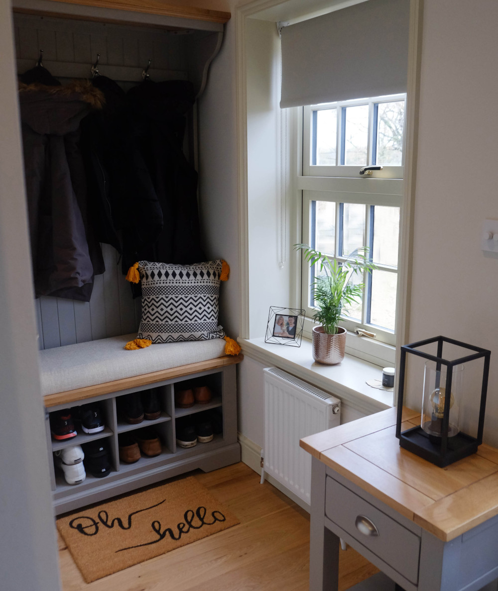
Many times the hallway of the home is ignored when decorating, however in most cases it is your homes first impression.
A hallway can be the optimum space to display artwork, family photos or other collections for the wall especially if you don’t have the space in other areas of the home. If you’re blessed with space in your hallway, and you want to create a more relaxed feel to your space, an unfitted storage unit is worth a thought.
Opting for an all-in-one unit that combines a coat rack with hallway shoe storage and a spot to sit down maximizes space while functioning as an attractive addition. I actually had my hallway built to fit this cloakroom stand.
The sturdy top shelf can be used for baskets of scarves and hats. Strong hooks hold your coats and bags. The whole piece offers a breathing space whenever you leave the house, or come home. The shoe bench is also available separately.
Stockists
Paint: Farrow and Ball – walls – Slipper Satin, woodwork – Old White no3, ceiling – All White
Furniture: Cloakroom stand and side table from Oak Furnitureland
Blind: Bloc Blinds
Accessories: Table light and shoe mat from Dunelm, photo frame and cushion from Sass & Belle, candle from Willow and Finn, storage basket (in set of 3) from Pavilion Broadway
Runner: Linens Limited
The cloakroom
The smallest but probably most used room in the house. I kept this space really simple. A waterfall tap from Wickes sits below our brass feature mirror from Cox & Cox and is paired with a cloakroom set from Soak.com.
I accessorized with a Boho look with a cold rug, towel and basket from Dunelm. I picked the black out of these items and also installed black towel rails and a toilet roll holder to add a bit more of a dynamic contrast to our neutral room and to pair the accessories. The cloakroom is the one room you can be a little experimental, so I may well add some more fun things in the future.
The living room
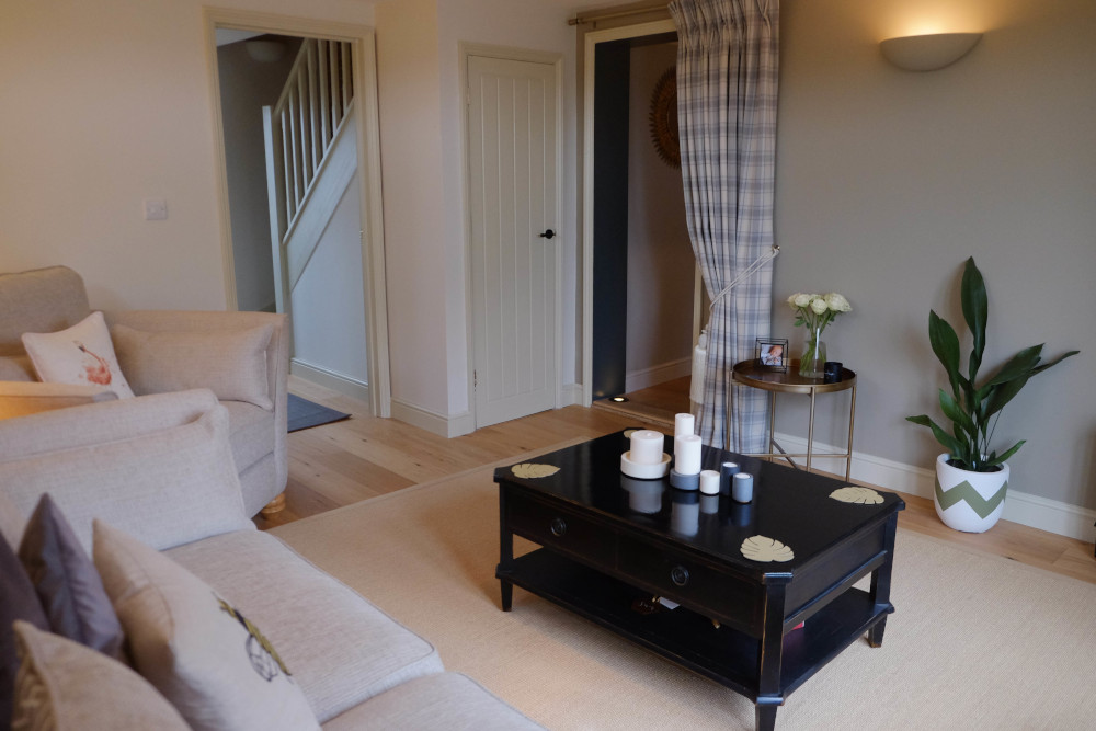
Our new living room was a blank canvas, but having loved our old living room so much (now the snug) we decided to use the same Farrow and Ball colours and again creating a feature wall with Light Grey.
The sofa and rug were purposefully neutral so that we could add bolder colours to the room including my 8 year old Laura Ashley living room furniture that has been taking a holiday in my shed for the past year!
We used gold’s to add warmer touches and had the most amazing made to measure curtains installed by Plumbs. We went with a wonderfully soft faux wool fabric for those cold winter nights with stripe and windowpane co-ordinates for a truly individual look.
A faux fur grey throw, gold leaf coasters from LINDDNA and a stunning candle set from Concrete & Wax all add textured finishing touches making this a really cosy room to be in.
I like this look because it feels clean and uncluttered. Whilst the black furniture does tend to show the dust the statement pieces are more than worth it. The rug from The Rug Seller is hard wearing and great for protecting the wooden floor, it also keeps noise to a minimum!
We also installed double French doors that walk out to our garden. This will be great for the summer months and for when Leo gets a little older and wants to explore the outdoors.
Stockists
Paint: Farrow and Ball – walls: Slipper Satin, feature wall: Light Grey, woodwork: Old White no 3 ceiling: All White
Furniture: TV stand, coffee table and side table – Laura Ashley, gold tray table – Alison at Home, Sofas 3 seater and love seat with footstool – Oak Furnitureland
Lights: Pendant – Industville, wall uplighters – Juice Electrical
Curtains: Plumbs
Accessories: Lampshades – Laura Ashley, cushions – Wallace Cotton and Cult Furniture, candles – Concrete & Wax, plant pot – Pow Pots, rug – The Rug Seller, fur throw – Bean Bag Bazaar, sea grass planters, basket, photo frames – Sass & Belle
The dining room
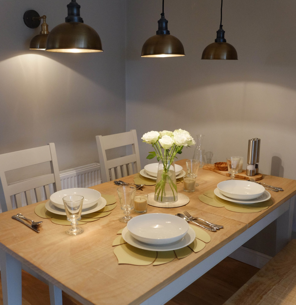
Your dining room is often the hub of the house, offering space for eating, working, entertaining, and more. In the dining room we went for a warm yet minimalist scheme with a light colour palette and a solid oak table with chairs and a bench to create more of a country style room.
The focus point is definitely the lighting. When choosing your dining room lighting, there’s not only the style to consider but practicality too. Is your space big enough for a statement light? How bright should the light be?
A pendant (or a few pendants) will focus light over a dining table or worktop, while a flush style suits smaller spaces. I love the three pendant look that we created, its a real centrepiece for the room.
We also added a beautiful gold mirror, which warms a cool grey room and is practical for when you need to check your hairstyle in the mornings! To match the table we added in a sideboard from Harveys which we have turned into a bar area… priorities!
Stockists
Paint: Farrow and Ball – walls: Purbeck Stone, woodwork: Ammonite Ceiling: Wimborne White, feature doorway – Railings
Furniture: Table, chairs, stool and sideboard – Harveys
Lights: Pendants and wall lights – Industville, uplighters (floor) Lumena Lights
Accessories: Mirror – Marmalade Tree local independent, coasters and placemats – LINDDNA, Glasswear – Adnams, Tableware – Moonson at Debenhams, cutlery – Viners, wine rack – Arighi Bianchi
The kitchen
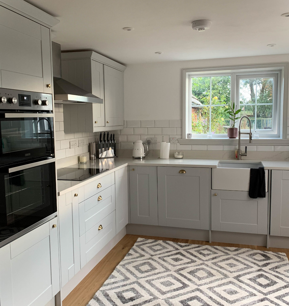
With 87 showrooms, Wren are the UK’s No.1 kitchen retailer. We knew roughly what we wanted but their expert advice was really valuable and helped bring our vision to life!
I would suggest hiring your own carpenter to install your kitchen (this saves a lot of money meaning you can spend a little more on a kitchen).
With this being a new room we had a blank canvas. We kept the colour really fresh by using Farrow and Ball – All White and used pure white tiles.
Gold handles warmed the grey tones in the shaker style cupboards and cabinets whilst a quartz worktop gave the kitchen a contemporary look.
We accessorised with a white kettle and toaster continuing the white minimal theme, and a black knife set complemented the black hob and oven. We also put in a stable door in this room, so that in the summer we can look out to the garden and the fields next-door.
Stockists
Paint: Farrow and Ball – walls: All White, woodwork: Ammonite Ceiling: All White,
Furniture: Kitchen designed by Wren Kitchens including appliances
Lights: Spotlights
Tiles: B&Q
Accessories : Kettle and toaster – Smeg, rug – Harveys, knives – Viners, cooker hood – Smeg, tap – Methven, handles – John Lewis, cup set – Sandra Vick
The snug
Again, being a room in the old part of the house – this room needed little doing to it. As per the guest room – a new lick of paint was in order to freshen the walls – plus we needed to fill in our old front door with a new window.
It’s hard to believe now that this room used to be our entrance room. For privacy (being at the front of the house) we have some great blackout blinds from Bloc Blinds.
Accent lighting gives the room a bit of a statement – these lamps came from Dusk Lighting. Both are complemented with the rug from Harveys, which again as we have done in other rooms pull in the black theme.
My sofa and armchair are 8 years old and have withstood 5 house moves can you believe, proof that if you spend good money on good furniture it will pay off – thanks Laura Ashley!
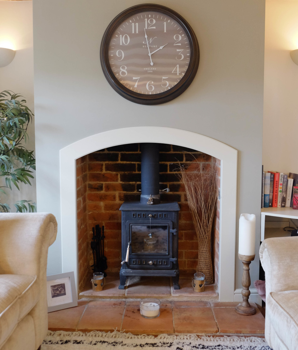
Our log burner is one of my favourite features of our cottage; it really is gorgeous in the winter when lit. So we created a feature wall and crowned it with a statement clock from Neptune.
This room is now a multipurpose room for work, relaxation and reading. We hope to build a few bookshelves at the beginning of next year to create more of a library feel to the room.
Stockists
Paint: Farrow and Ball – walls: Slipper Satin, feature wall: Light Grey, woodwork: Old White no 3 Ceiling: All White
Furniture: Filing cabinet and desk – inherited, sofa and armchair – Laura Ashley
Lights: Uplighters – Juice Electrical
Blinds: Bloc Blinds
Mac: John Lewis
Accessories: Lampshades – DUSK Lighting, cushions – John Lewis, rug – Harveys, clock – Neptune
Other features…
My husband wanted to keep a bit of the old house alive, so we decided to keep an exposed wall in the landing. With such beautiful warm red bricks it seemed a shame to cover them up so we used some brick sealant to secure any dust or loose particles. Hats off to the hubs for this genius idea.
Again to celebrate the old joining the new I thought it would be a lovely idea to uplight the walkway from the old part of the house to the new. These up-lighters are gorgeous in the evenings and illuminate that divide. It’s a subtle reminder of just how much we have achieved in a year.
Lastly, as mentioned earlier the Juliet balcony has made my childhood dreams come true. It will be wonderful to have the bedroom doors open in the summer to let the outside in!
I would like to take the time to thank everyone involved in our project. From family to friends and suppliers we now have a beautiful home to showcase. It’s been one crazy year (and doing this whilst being pregnant and having a baby hasn’t been ideal) but we got there in the end.
Click here to view my video by Middle Sea Media.


