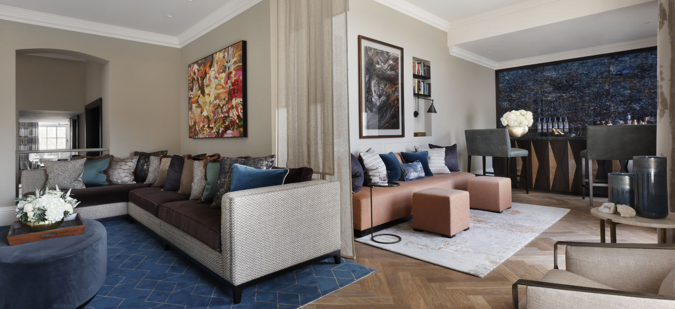
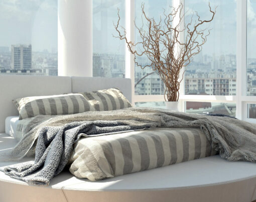
When it comes to reimagining a room or multiple rooms in your home, the walls, floors and larger items of furniture are the first considerations with art pieces and accessories providing the finishing touches. But what do you do when you realise that there are some awkward corners to fill?
Those corners can make an otherwise beautiful space look incomplete, whether they are too small for a side table or too big for some wall art, but you can be sure that there are plenty of options for filling them without cluttering your home.
For some interior inspiration we spoke to six different interior experts who gave us their top tips on how to fill any empty corner in a room.
1. Mirrors and antique finds
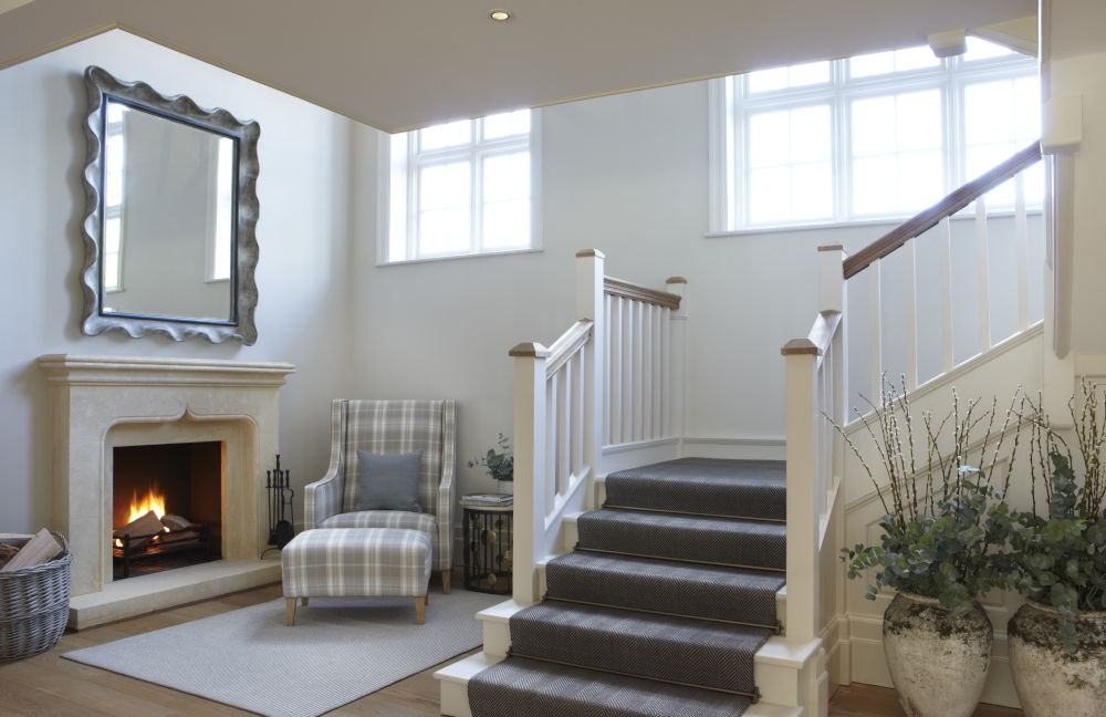
Transitional zones, such as entryway corners or the hallway, are spots which are visited frequently by family and friends. Even though these are highly trafficked areas of the home, people don’t tend to spend time in them. For statement decoration, opt for eye-catching mirrors as people walk by.
Vanessa Arbuthnott, CEO and designer at Vanessa Arbuthnott said: “It’s good idea to plan to use a mirror in your hallway for many reasons. One is that you will create much longer and brighter hallways. Secondly, it’s easy to take quick glance on the way out to check your hair! There are so many different styles of mirror, so be sure to choose one that reflects your style. This could be an antique, rustic, vintage or modern mirror that hangs on one side of the hallway over a narrow table or fireplace.”
2. A decorative shelf
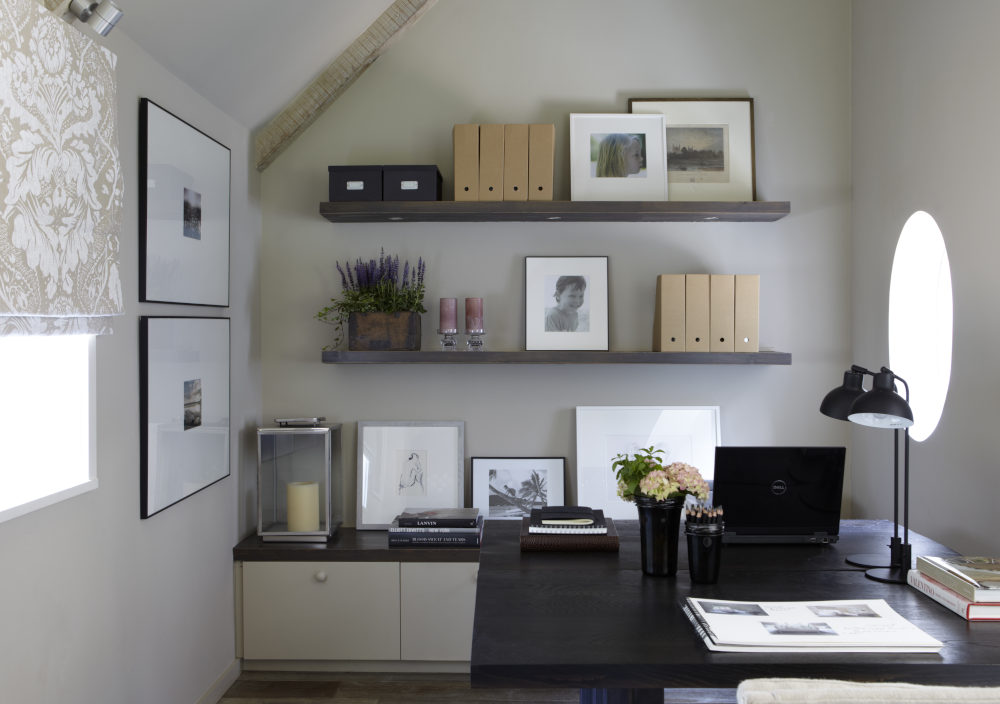
Do you need more storage space for stylish accents and keepsakes? Installing floating shelves can be an attractive way to make sure your design objects and accessories are put on display without creating clutter.
Alex Wilcocks, property designer at Burbeck Interiors suggested: “Larger, bulky corner shelves or bureaus can clutter the space, so I would recommend decorating with smaller, thinner shelves. These are great for additional storage, and when decorated with eye-catching ornaments, lamps or photos, can look quaint. If you are working in a larger room, a stylish bookshelf can create an appealing focal point and add warmth to the room.”
3. Install a dry bar

Whether you consider yourself a mixologist or simply like to host parties, bar carts are one of the most stylish pieces of furniture to have in your household. Whilst bar carts were previously seen as a relic of the past, they have become a fashionable way to display your favourite spirits and glassware, whilst having the functionality of a moving bar. This makes it perfect for fitting in and filling up any awkward corner of the room
Jennifer Jarvis, Senior Designer at Helen Green Design said: “Placing the bar cart in the corner of a dining room is both decorative and functional. Select a bar cart in the same or a complementary finish with the rest of the room to tie them together. When styling your bar cart choose bottles that have varying heights and widths for styling. Add some crystal glasses and a beautiful cut glass bottle opener to finish.”
4. Present art in a unique fashion
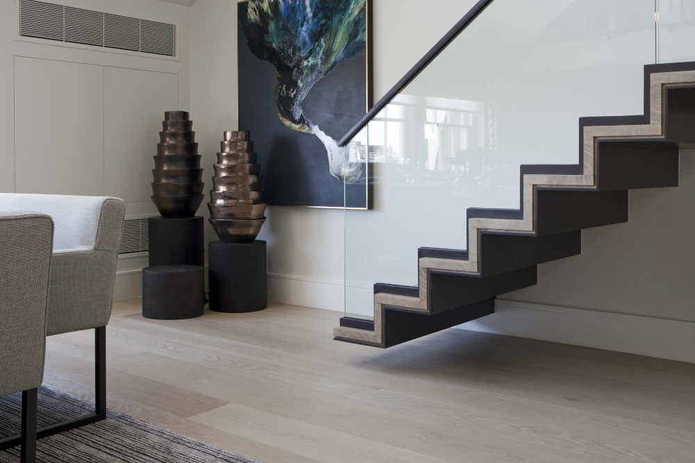
Art is a great way to balance out a room’s décor and fill empty, awkward corners. Whilst you could hang up a simple painting, it may be more interesting to opt for different art arrangements or sculptures. Sometimes one special piece is all it takes.
If you have a somewhat larger space then James Ashfield, studio manager at Rigby and Rigby has a unique suggestion: “We like to incorporate art and sculpture into homes in unique ways. One way we have done this is by using a car stacker as a sportscar gallery. The car is driven into the stacker from street level and lowered into a glazed car gallery on display within a media room.”
5. Shed some light into empty corners
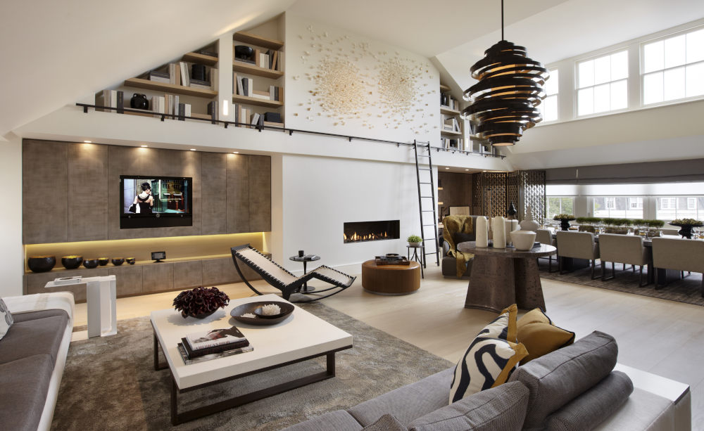
Corners tend to gather shadows and become dark, dull spaces in your home. Installing the perfect light fixture can be enough to take your interior design to the next level. Whether this be a large salt lamp for a soft glow or hanging lightbulb fixtures for extra drama, adding some light to brighten up the space can easily transform a whole room.
Ally Dowsing-Reynolds, co-owner at interior fixtures and fitting specialist Dowsing and Reynolds said: “First and foremost, consider how you want to feel in the room before deciding on a lighting scheme. If it’s a space for relaxing, such as a living room, then you might be surprised to hear that having multiple lights in your room will actually make it feel cosier.
“Combining dimmable wall, table and floor lamps creates a cocooning feel that you can easily control. The turned-down light has a soft glow, casting beautiful shadows in all corners of the room. If you are just working with an empty corner, style with a unique floor lamp to draw the eye’s attention around the space. Combine this with a dimmable wall light to create additional pockets of ambient light.”
6. When in doubt, pick up a plant
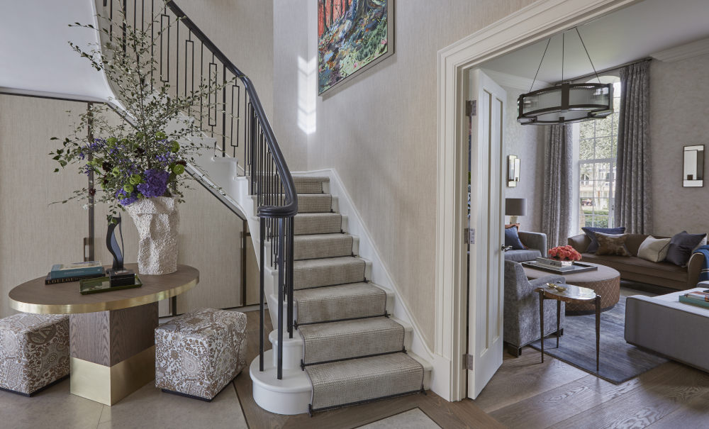
Plants can brighten up any space in an architectural and dramatic way. Indoor plants have a much longer life span than cut flowers, and they can fit into empty corners like a snug piece of furniture. Spruce up any dull and lifeless corner with Ella Jade’s picks.
Ella Jade, founder and designer at ROOBBA suggested: “Plants can be a beautiful detail to perfect your room, and they fit nicely into empty corners. If you’re looking for a dramatic effect, try using a ‘Money Tree’ plant which has a beautiful, braided mini tree trunk. This will be sure to catch any guest’s attention and you can use an oversized plant pot for extra creativity.
“You could also opt for a ‘Snake Plant’ which has tall straight leaves of differing heights. This will add a charming focus in any corner. If you’re looking to add colour, try blue or coral orchids. Experiment with putting plants of varying colours and different sizes together to create a magnificent display.”
All images in article courtesy of Helen Green Design.


