Tonik Associates is a leading partner in the creative design industry, taking a collaborative and holistic approach in helping businesses to think, design and deliver from concept through to completion and beyond. They look after every part of the design process, from consultancy and brand design to build management, interiors and marketing.
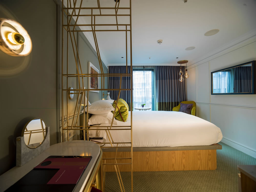
Recent Tonik projects include a full refurbishment of the Middle Eight Hotel in Covent Garden and creation of The Guardsman Hotel in Westminster, both of which have resulted in various award nominations at the upcoming International Hotel and Property Awards.
We spoke to Tonik to find out more about the projects, current trends and what the future holds for the industry.
What was your inspiration for the Middle Eight Hotel?
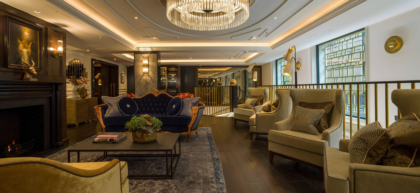
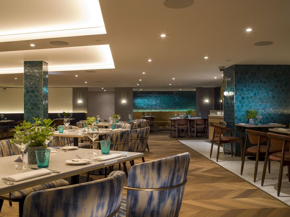
Middle Eight is an urban lifestyle brand and it needed to reflect the location that it’s in. Due to its central, Covent Garden location we had a number of ideas at the start of the project including, theatre, professional, legal etc. We didn’t want it to become too cliché and so we played on the historic element of the hotel’s location and that fact that it was the original Kingsway Hall music venue, hence the focus on music which has inspired the hotel interiors. Alongside the musical emphasis, sustainability and nature also played a huge focus for the hotel design inspiration. When you enter the hotel we wanted it to feel organic, free flowing and natural. This was achieved by the use of natural materials such as wood and stone.
And what were your influences for The Guardsman?
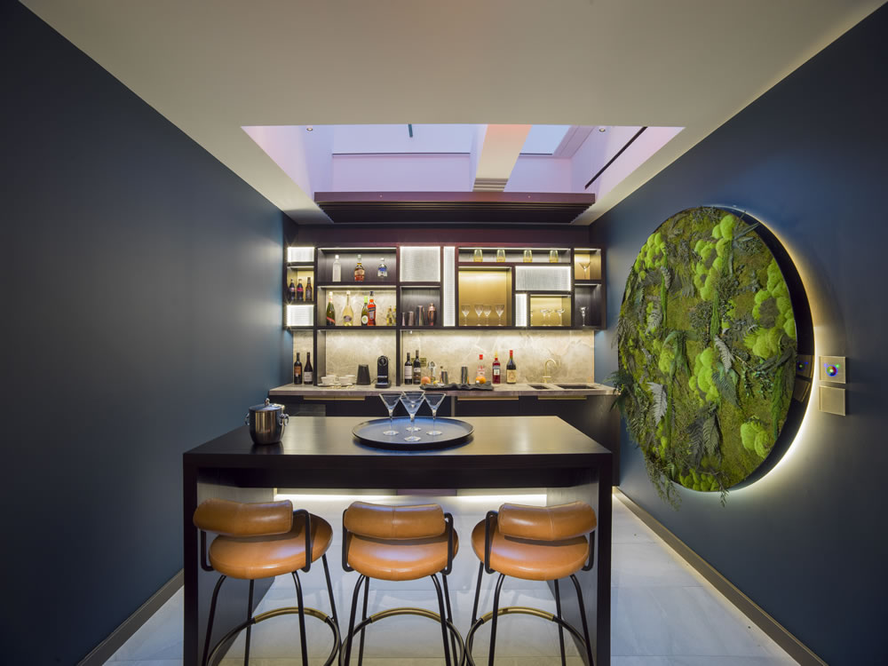
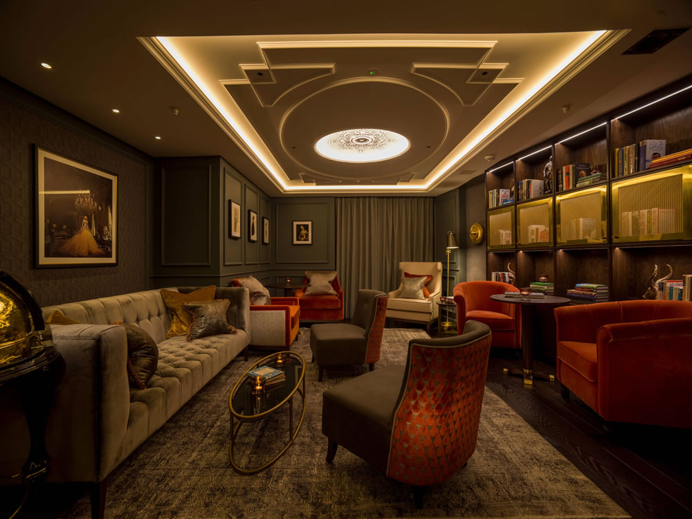
The key influence for The Guardsman was for all areas to appear bespoke, like a private members’ club. We created three design queues which inspired the interiors all heavily linked to the hotel’s location and royal connections; secret service, imperial, palace gardens. Within these three queues, three colour palettes were created and three styles of bedroom designed to match the themes. The result of this and due to the fact that the hotel has a large variety of room size, meant that each guest room within The Guardsman is unique in either design, size or layout.
This theme continues throughout the public spaces, however the common areas focus more on looking back at British history through a modern day looking glass. The hotel in general is inspired by all things British, however due to the modern look of the hotel exterior, it was important that we gradually introduced this, and the further away from the façade you get the more the British theme comes into play.
What challenges did you come across when working on the projects?
Middle Eight was an existing building and we had to re-purpose a number of the areas, which included knocking some spaces down and starting again. We needed to increase the ground floor footprint, which meant turning outdoor space into indoor space. In order to increase the food and beverage venues we designed a mezzanine floor above the restaurant, however then needed to give the spaces the perception that the ceilings where higher than they really are. Finally, the first floor meeting space was to be transitioned into luxury suites, however the rooms themselves had no windows. To overcome this obstacle we built skylights in the suites in order to flood the space with natural daylight.
The Guardsman is a new build and has been developed in a very compact space. Through clever design, detailing and luxury finishings we were able to achieve a luxurious finish. Every square metre of space within this hotel was carefully considered.
What is your process when coming up with design ideas for projects like these hotels?
With most projects we tend to use a similar format to the below. Considering we were designing two hotels for the same client both of which required their own personality and identity it we even more so important to follow this process:
- We start by carefully listening to the clients brief in terms of what they think they want to achieve.
- Next we re-analyse that brief in the context of the market, location, target market and competition within the area in order to ensure that we have fully understood and can highlight any potential issues early on.
- Then we replay that brief back to the client to make sure that the starting point is correct and no miss-matching between their vision and ours.
- The next stage is all about research; we took a considerable amount of time over this to research story ideas unique to the project and discovering the area.
- Then we looked at how we can address the brief with an unexpected solution so that essentially we can create that wow moment for future guests.
What is your favourite project that Tonik has worked on?
Five years ago we began working on a project called Latitude – combining co-working with social clubs. The idea of combining the two means that you elongate your day and make use of space – it was relevant then and even more so now. Creating spaces where people want to spend more time because of the way they look and attract a certain type of person – essentially it becomes a place where people can create a community. This is difficult to do because there is a very different mindset between working and playing – everyone thinks you can’t but we are certain you can.
What’s the biggest thing that you’re finding clients are asking for at the moment?
We’ve recently changed our business model to be more solutions based rather than experience based as we’ve found more and more that people are asking for solutions that go beyond their own expertise. This has enabled us to use creative design in order to solve their problems.
They are no longer coming with a brief; they are coming with a problem which gives us the opportunity to solve. The way we think means that we can extend the client’s brief to think outside the box.
What’s your favourite current trend?
The fact that sectors are merging together at the moment is something that hugely excites us. Working across retail, hospitality and workplace means that we can apply our experience to all sectors. This is not just a design trend, it’s about re-booting people’s mind-sets. What would have been the norm two years ago is no longer. For example, look at Saks 5th Avenue putting WeWork in to their department store. This would never have happened in the past and it’s hugely exciting.
What’s the next big thing in hotel design?
Flexibility of space – people are looking for the whole experience, not an individual experience. Hotels need to be known for something particularly the urban hotels,
Everyone talks about being experiential but it goes further that this, hotels need to be the best at something. You can go anywhere for an experience but you need to focus on the thing you want to be known for. i.e. the entertainment, amazing suites – hotels try to be all things to everyone and design is a really great way of differentiating.
Do you have any projects in the pipeline that our readers would be keen to know about?
uRevo is a really exciting project that we are currently working on, it’s all about re-booting the retail landscape with retail not finding an alternative. The future of retail sites isn’t about replacing them with something new like a go-karting track or a cinema; it’s about bringing the e-commerce brands in and expanding their coverage into a physical space.
All imagery used in this article credit: Tonik Associates


